Constructing a Candlestick Chart
Four pieces of data, gathered through the course of a security’s trading
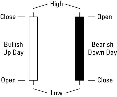
day, are used to create a candlestick chart: opening price, closing price,
high, and low. The candle in a chart is white when the close for a day is
higher than the open, and black when the close is lower than the open. The wicks,
lines sticking out of either end of the candlestick, represent the range
between the day’s high and low prices. The wick on top shows the day’s high,
the wick on the bottom shows the day’s low.

Additional information is sometimes displayed with candlestick charts. Don’t
be afraid to use it! The following types of information are commonly
included on candlestick charts and can be very useful in your analysis:
-
Volume: The total
number of shares or contracts trading during a time period.
-
Open interest: The
total number of open contracts on a futures product.
-
Moving averages: Lines
that represent the average closing price for a time period and a few
periods in the past.
-
Technical indicators: Statistics
that can be displayed in a variety of ways on a chart.
-
Fundamental information: Data
that includes dividend dates, days of share splits, or even insider
buying and selling!
Candlestick Chart Analysis and Trading Tips
If you’re examining or trading a candlestick pattern, keep these guidelines
in mind before you decide what to do with your money, so you can make an
informed decision:
-
Determine whether the market is trending up, trending down, or not
trending at all.
-
If you put on a trade, be prepared to identify the point at which you
take a loss, especially when you’re trading against the trend.
-
Try not to anticipate that a pattern is going to be created by trading
before the formation is complete.
-
Use technical indicators to complement patterns. Indicators help to
confirm your opinion of the market trend.
-
When putting real money into trading, don’t trade what you can’t afford
to lose!
Common Candlestick Patterns
You can become more familiar with some common and dependable candlestick
patterns by checking out the following figures. (Remember, they don’t
represent every possible candlestick pattern.)
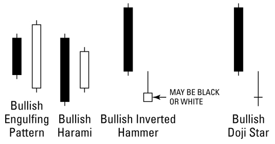
Bullish two-day trend reversal patterns
These charts are a few of the most common and reliable bullish two-day trend
reversal patterns in an uptrend.

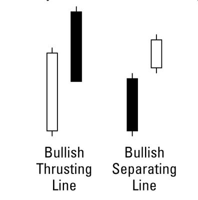
Bullish two-day trend continuation patterns
These patterns are common and reliable examples of bullish two-day trend
continuation patterns in an uptrend.

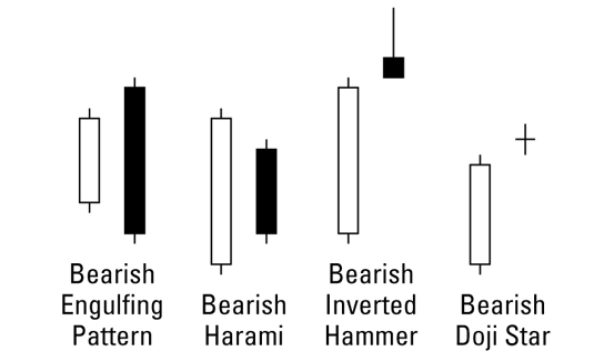
Bearish two-day trend reversal patterns
These figures shows some of the most common and reliable types of bearish
two-day trend reversal patterns in an uptrend.

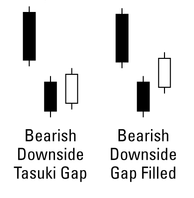
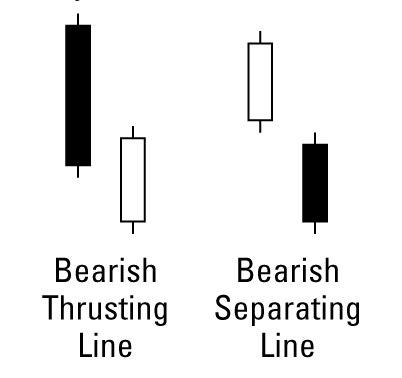
Bearish two-day trend continuation patterns
These reliable two-day trend continuation patterns may show up frequently as
you look through your candlestick charts.

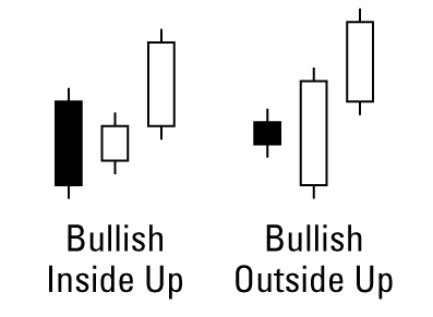
Bullish three-day trend reversal patterns
Here are a couple common bullish three-day trend reversal patterns.

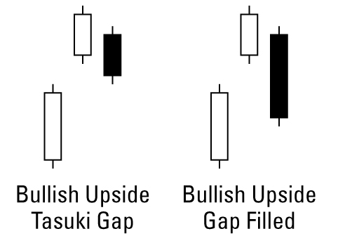
Bullish three-day trend continuation patterns
These two patterns are common examples of bullish three-day trend
continuation patterns.

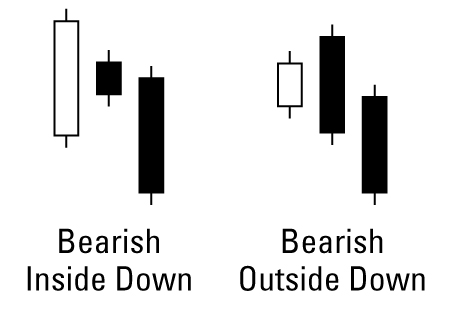
Bearish three-day trend reversal patterns
These are a couple of the most common bearish three-day trend reversal
patterns.

Bearish three-day trend continuation patterns
Here are two common examples of bearish three-day trend reversal patterns.
